Before we talk about shape and space, we need to discuss line...
A shape is made of a line or lines.
A shape has an inside and and an outside.
The line or lines that make up the edges of the shape must completely enclose the space within.
For this project we will be using lines to create shapes.
Since we will be cutting our shapes out of construction paper we will be keeping them very simple.
Start with a 9x6 piece of black construction paper. Place it in the center of a 12x18 inch piece of white paper. Put small marks on the white paper to indicate where the corners of the black paper are.
Now start to draw and cut out 2 identical simple shapes starting at opposite sides of the black paper.
Have your first two shapes be made of curved lines. Cut them out and flip them over. Do not do any trimming at all.
 |
| Shapes made from Curved lines |
Continue to cut out simple pairs of shapes from opposite sides of your black paper, using the basic types of lines. Do not make your design too complex or scribbled. Remember that you have to cut out every shape that you draw.
 |
| Shapes made from Curved Lines and Zigzag Lines |
 |
| Shapes Made from Curved lines, Zigzag Lines and Straight Lines |
 |
| Final Design |
Before gluing down your final design, carefully remove the large center piece and take a quick look. You should be able to see a ghost image of the original rectangle.
You can see the white rectangular shape in the middle of the paper even though it's not really there at all. That is what artists are referring to when they speak of the 'negative space' or 'negative shapes' in a composition. Negative space is as important as positive space when designing a picture. This is why we art teachers are forever telling our students to fill the page! If you draw something large enough, it will go off the side of the page and divide the background into interesting negative shapes.
Here is an example of a photograph where the negative shapes of the sky are as important as the trees.
Next time you take a photo try zooming in on the most important detail, even if it means you don't capture the entire image. If you have your photographs stored on your computer, try cropping some of them.
When taking this photograph, I thought about the blue shapes framed by the leaves.
The more aware you are of negative space the more engaging and dynamic your compositions will be.
Student Gallery:
 |
| 7TH GRADE STUDENT |
 |
| 6TH GRADE STUDENT |
 |
| 7TH GRADE STUDENTS |
 |
| 7TH GRADE STUDENT |
Big shout out to my friend Kiki, a helpful art teacher from Kentucky, for letting me know that this type of cut out is called a 'Notan'. Notan is a Japanese word that means light and dark. The helpful art teacher is ever grateful and always learning.
 |
| Successful photographers are aware of negative space. Check out this beautiful composition by photographer Lyle Booth |
Helpful links for this project:
Examples of Notan in Japanese Art
(balance of light and dark and positive and negative)
|
|
"Moon Pine, Ueno, No. 89 from One Hundred Famous Views of Edo
In Edo, there was a particular taste for naming trees that were distinguished by their age or their form. Pine trees, which tend to live long and grow in strange shapes, were the most common of these. The example seen here was called the Moon Pine, not only because of its full, round shape but also because one could discern various phases of the moon by looking at the tree from different angles. One twentieth-century commentary also referred to it as the Rope Pine, presumably because of its resemblance to a loop of rope."* *(Information from this picture quoted from the website of the Brooklyn Museum) Artist: Utagawa Hiroshige (Ando), Japanese, 1797-1858 Medium: Woodblock print Place Made: Japan |
Brooklyn Museum: Maple Trees at Mama, Tekona Shrine and Linked Bridge, No. 94 from One Hundred Famous Views of Edo
|


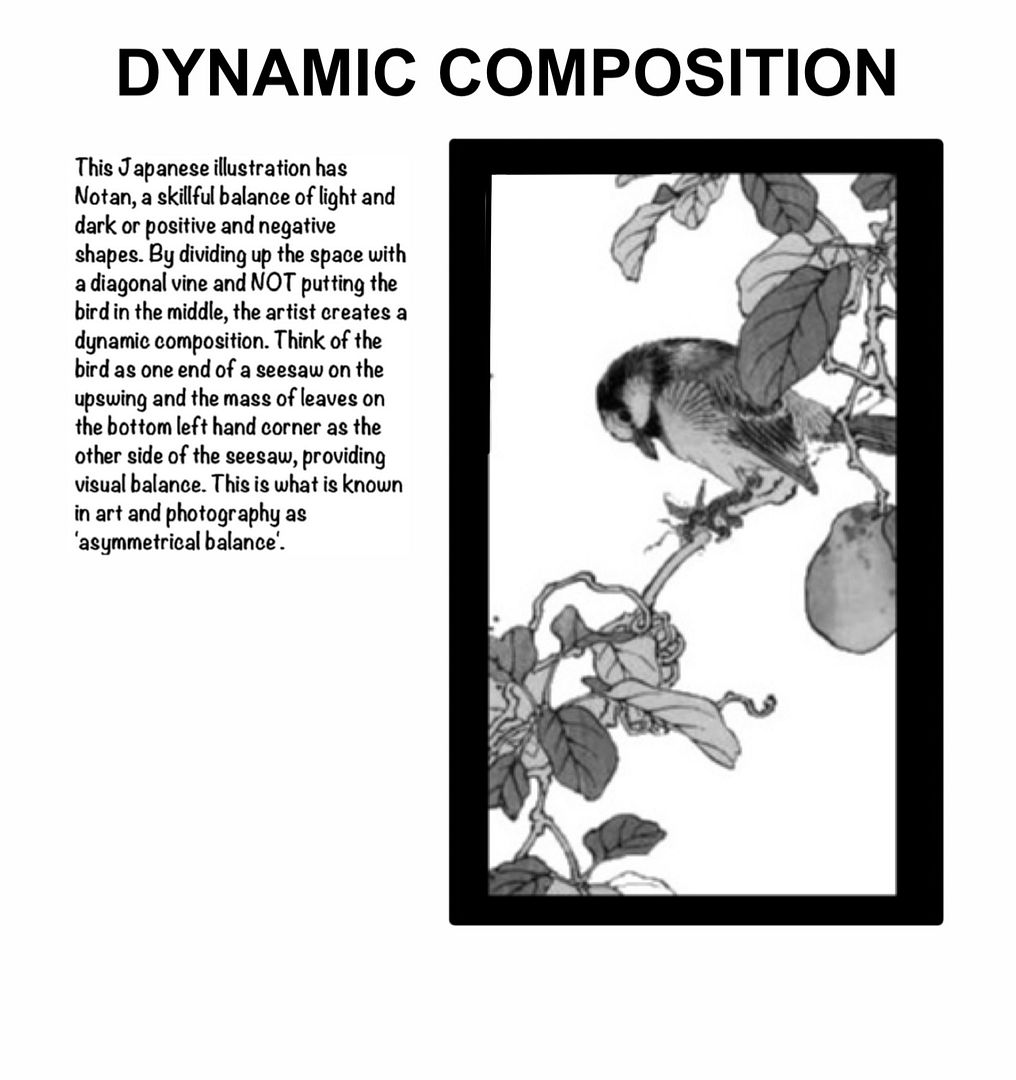
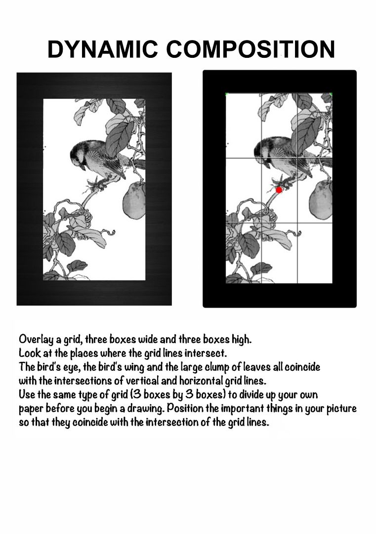
Use the 'rule of thirds' (also sometimes referred to as the 'rule of three')to create dynamic photographs and paintings. Worksheet created by The Helpful Art Teacher, 2013, using a Japanese woodblock print book illustration from the Metropolitan Museum of Art's digital library
Here is a higher resolution image of the illustration.
Try printing it and adding your own grid lines.
Analyze printouts of your favorite paintings to see which ones follow the 'rule of thirds' and which do not.
Print out low resolution black and white versions of famous pictures and draw your grid directly on the image but make absolutely sure the image you are using has not been cropped!
New Jersey Core Curriculum Content Standards that can be applied to this art lesson:
1.3.5.D.3 Identify common and distinctive characteristics of genres of visual artworks (e.g., realism, surrealism, abstract/nonobjective art, conceptual art, and others) using age-appropriate terminology, and experiment with various compositional approaches influenced by these genres.


This is a wonderful lesson plan, thank you for posting.
ReplyDeleteThank you for being the helpful art teacher. This is a fabulous lesson plan, with everything needed to walk students through it.
ReplyDeleteThanks so much for this! I will use this first to introduce Native Art
ReplyDeleteEverything is very open with a very clear explanation of the challenges.
ReplyDeleteIt was really informative. Your website iss very useful.
Many thanks for sharing!
Hello, I read your blog like every week. Your writing style is awesome, keep
ReplyDeletedoing what you're doing!