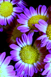
Warm Colors
 |
| The warm colors are red, red-orange, orange, yellow-orange and yellow These are analogous colors (colors that are located adjacent to each other on the color wheel) |

Cool Colors
 |
| Greens, blues and blue violets make up the cool colors These are analogous colors (colors that are located adjacent to each other on the color wheel) |
Here are some pictures, with an analogous color scheme, where I used mostly cool colors:
In general, if you add more blue to a picture it will look cooler.
If you add more yellow to a picture it will appear warmer.
Here are two versions of the same picture;
one with yellow added to appear warmer...
...the other with blue added to appear cooler.
During his blue period, Pablo Picasso painted very sad paintings. He used cool colors to express his feelings. These pictures often had analogous color schemes. To learn more about Picasso's blue period click here.
Try It:
Create an Analogous color scheme:
 |
| Try mixing yellow and blue. First, mix a color with a lot of yellow and just a bit of blue. What happens to the color as you gradually add more blue? |
A picture with just one color plus black and white is known as a monochromatic picture.
Try It:
Create a Monochromatic color scheme:
 |
| Select a single color of paint and create a simple design using just that color plus black and white. When you add white to a color you create a tint of that color When you add black to a color you create a shade of that color. a monochromatic painting contains a single color plus black and white |
COMPLEMENTARY COLORS
When we put a warm color next to a cool color both colors stand out and appear brighter. This is known as contrast.
Complementary colors are also known as 'opposite' colors because they appear opposite each other on the color wheel.
Let's start with red, yellow and blue, the three primary colors. Here is how you find their 'opposites' without referring to a color wheel:
 |
| Red and green are complimentary colors |
 |
| Yellow and violet are complementary colors |
If you mix red and blue, you will get violet. Which primary color did you not use?
You did not use yellow. Yellow and violet are complementary colors.
If you mix red and yellow you will get orange. Which primary color did you not use? You did not use blue. Blue is the complement of orange.
Here are some pictures where I used complementary colors to create contrast.
 |
| Orange and blue are complementary colors. I deliberately framed the orange leaves against the blue sky to make the leaves look brighter |
 | ||
| Red-orange is directly opposite blue-green on the color wheel. They are complementary colors. The red-orange flowers appear to 'pop' out of the picture. Violet and yellow are complementary colors
|
Mixing a color with it's complement will make the color duller or less intense. Artists will often dull down a color if they are putting it in the background so that it will appear to recede.
The video below demonstrates exactly how this works:
To learn more about how to use advancing and receding colors to paint a realistic landscape, see my post on ATMOSPHERIC PERSPECTIVE.
Artists will also mix two complimentary colors to create shadows without using black paint.
Look at the worksheet below to see how:


Came over via Angela DiJoseph's recommendation. LOVE the site & your dedication to keeping it safe for children.
ReplyDeleteMany blessings!
Thank you so much Michele. Are you a home schooler like Angela? If you would like to send me pictures of your child's art work I would be happy to look at them. I have added an email address to this blog. It is in my profile.
ReplyDeleteJust stumbled here! We're homeschooling too. Great website!! Is there a progression or order we can follow to use your materials and ideas sequentially? Thanks for sharing your excellent resources.
ReplyDeleteThe lessons that follow a sequence (such as perspective drawing) should be so noted. In such cases, I have tried to provide links within the post to the lessons that precede and follow so you can learn the concepts in a logical order. Other projects can be introduced according to your child's interests. I do not have time to cover all lessons each semester and am constantly adding new lessons. In addition, some of the material here is not covered in my classroom at all. It's there for advanced students to explore independently. All lessons are appropriate for 5th grade through college but can be modified for younger students. Hope that helps. How old are your kids?
ReplyDeleteWoW! I do not homeschool, but I just signed on to be a Girl Scout troop leader and I would love to have the girls develop art skills as an activity. I too, would be interested in finding your lessons. I'm already loving your tutorials for myself!
ReplyDeleteI am leading an art and spirituality program for seniors and middle aged people. I think your presentation on color would be perfect for them. Do I just set up lessons from your on line presentation or do you have further materiel to assist me in teaching and planning. Loved your presentation
ReplyDeleteI would like to use your color theory presentation to teach basic color theory to a group of seniors. An excellent presentation. May I?
ReplyDeleteCertainly. My pleasure
Deletethis is helpful thanks
ReplyDeleteThanks for this info. Dream
ReplyDelete